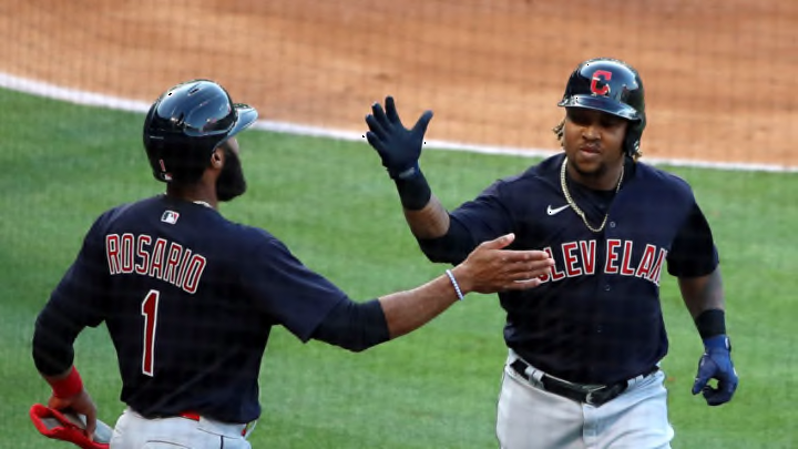
The Indians want to change their name and fans have suggestions.
Last summer the talk was all about the name change of the Cleveland Indians. While many people have opinions about it, the fact remains that it’s probably going to be changed eventually. You can like, or not, that’s entirely up to you. The suggestion that makes the rounds that I think most people would accept is “The Guardians”, an homage to one of the most profound and beautiful landmarks our great city has to offer, the Hope Memorial Bridge, which features four, two-sided large sculptures (eight Guardians in total) that welcome travelers to the bridge on each side.
It’s an appropriate name for the current Indians, as it not only pays respect to the bridge, but to the fact that Cleveland is among the cutting edge in health care. Health care workers are some of the most well-known types of guardians in the modern world. So it’s apropos on several levels.
Now, there will be people who will screech about “not supporting the team if they change their name.” Sure, do what you will. There will also be others who’d prefer a different name than the Guardians, and that’s ok too. Other ideas like the Municipals and the Spiders, a throwback name to the original Cleveland baseball team (the Spiders did not become the Indians and are two separate franchises), are also highlighted below.
Fan-made art of the Guardian’s logo is inspiring.
You can’t please everybody. Some people are so wrapped up in a fictitious culture war, that they’re willing to cut off their nose to spite their face. If you love the team, why would you care what’s it called? That said, if that’s your prerogative, go forth and find your bliss. For this writer, the fan-made logo for the Guardians is nearly perfect.
Of these 3 options what would you want to see the Indians change their name to? pic.twitter.com/EuxUERpJyF
— CLE SPORTS WORLD (@Browniestalk) May 8, 2021
The colors aren’t right, too much grey. The uniforms are overdone, but if you take the logo from the Guardians and put it with the color scheme and uniform layout of the Municipals, I think people will really vibe with that.
And if there are some who don’t, that’s ok.
