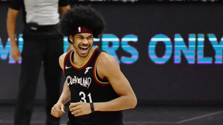
The Cleveland Cavaliers unveiled new, but familiar-looking logos.
The Cleveland Cavaliers have unveiled new logos for the 2022-2023 season, and while they’re different they’re far from being actually “new”. These logos aren’t new in the sense that we haven’t seen the logos before, we have, but they’re new due to the color scheme.
The logos, as you can see below, have a bit plainer color scheme, with the wine-red and now a more metallic gold being the two most prominent colors, with the black outline helping to make it a bit more dynamic. The former mustard-gold is gone, as is the navy-blue accent that most people didn’t know existed until this very sentence.
The logos themselves haven’t changed much, with the shield logo losing the sword, and all of them featuring the new color scheme. Plus, the classic “Cavs” logo, with “V” serving as a hoop and the ball going in is back, but it’s been reworked a bit. That’s one of my personal favorite designs from the earlier eras of the 90s, so seeing that once again is great.
The colors are a bit more docile, which is refreshing, though I still long for the blue and orange to make their return eventually.
I dig it.
— Factory of Sadness (@FanSidedFoS) June 2, 2022
What say you, internet?#Cavaliers #Cavs pic.twitter.com/IL9Hohr74J
Cleveland Cavaliers appear to be ready to roll out not just new logos but new jerseys
I like the new colors and the new logos. They’re really solid and aren’t too far from what the Cavs have been working with for about two decades. Yet, the big deciding factor on how good these new designs work with the new uniforms.
The Cavs are planning on unveiling new uniforms very soon, and if the new logos and uniforms don’t clash well, then fans, including myself, may have a different opinion over how these logos look.
Here’s hoping they’re not as bad as the 2010-2017 era jerseys.
