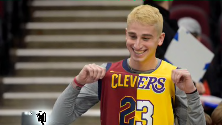
The Cleveland Cavaliers unveiled new uniforms and um, yeah…about them…
I’ll be the first one to admit that my opinions change. Those Cleveland Rock City Jersey from a couple of years ago were not my favorite thing ever, but they grew on me. I liked them in time. The 2021-2022 City Jersey’s? No thank you. So keep in mind that I may not like the current Cleveland Cavalier uniforms now, but my opinion can always change.
That said, just because it can, doesn’t mean it will. Apparently, the 2022-2023 Cleveland Cavaliers are being fully supported by the Bananas in Pajamas community, as the Cavs have made the interesting choice to wear pajamas on the court.
As the great Pepper Brooks once said; ” It’s a bold strategy, Cotton. Let’s see if it pays off for ’em.”
The Cavs have three new uniforms and they all touch on different eras of the Cavs. The home is all white, with wine-colored lettering and numbering. It bares the late-90s era Cavs logo. I’m a sucker for that logo, and I like the white jersey’s the most for that reason.
The black design is a throwback to the championship team in 2016, complete with the swooping “C” logo.
Lastly, the wine-red jerseys will feature the word “Cleveland” and have gold as the lettering and numbering. The City Uniform is also coming later this year and will be another white color design.
#Cavs dropped their new uniforms. As I reported yesterday, it’s a black, wine & white set. 4th City uni which will also be white, will be released later.
— John Sabol (@John_Sabol) July 18, 2022
New unis use new gold & new “Hoop V” logo. Very simple. Basic. And too plain IMO. Still an upgrade.
Thoughts?@fox8news pic.twitter.com/2SSK7e2ZWh
The minimalistic approach makes the jerseys seem like sleepwear
if you’re a Cleveland Cavaliers fan and you enjoy sleeping in your jersey and shorts, these new sets will surely be up your alley. They’re by no means bad, and while I’m no fan of the wine and gold color scheme, some of these look really inspired.
That said, the minimalistic design of the jersey, leading to the shorts, makes these look like an athletic version of a jumpsuit. All we need is a belt and we can reenact that scene from Scrubs, where the Janitor explains that his uniform isn’t a jumpsuit.
The logo and lettering are great, and while I’d prefer the blue, black, and orange color scheme I grew up on, this isn’t bad, yet the plane-ness of the shorts and jersey just doesn’t evoke much in me at the moment. The whites are great, the blacks are a throwback (but I wasn’t a fan of the long-sleeved version in 2016 either) and the wines are just, meh.
These aren’t the worst (hello mid-2010s), but they’re far from ideal.
