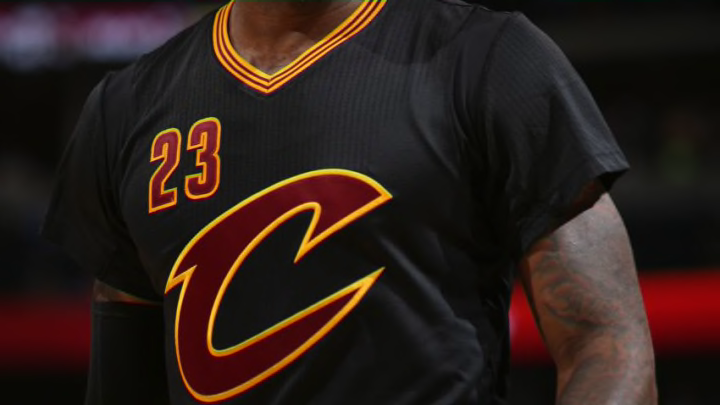
The Cavs have released their new city jersey’s for the upcoming 2020-2021 season and they have certainly divided the fanbase.
As the NBA season draws nearer and nearer, teams across the Association have been unveiling their new city jerseys for the upcoming 2020-2021 season. The city jerseys are a special type of jersey designed by Nike with teams’ specific cities in mind. They’re designed to elicit pride in a franchise’s home town but often fans are confused by the yearly updated jersey variants. That’s not a trend that’s going to be snapped by the Cavs this year, as fans are confused by this year’s version.
Most times, the jerseys are variants of the base version, with a slight color swap or font change. For the Cavs, it’s been a history of both. Last year saw the Cavs place the “CLE” short-hand on their front, written in a cursive styling, with yellow lettering on top of a dark blue jersey. In 2018, it was a blue and orange combo, in a bit of a wave pattern. The first version of the jersey in 2017 was grey, that embraced the Guardians of Traffic statues, with “The Land” on the front.
This year, they went all black, with yellow and red trim, and a whacky font that simply says Cleveland, with the Cavs C-logo to start it off, before transcending into a font that can only be described as the type you’d use if you were ransoming someone’s loved one. The back then shows a simple text that displays the player’s name.
The duel font has some people scratching their heads.
https://twitter.com/AmNotEvan/status/1333157783978586113
The term “empty” was also thrown around on social media, which is fair, as the past versions of these jerseys always had a bit more style and substance to them. While the clashing lettering may be bombastic, it’s also not very much to base a jersey around. While not every version of this jersey landed before, the past versions were at least more impactful.
That’s not to say that all the fans of the team hated the jerseys. As always, it’s a subjective thing, but even the most diehard fans who like these versions of the city edition will admit they could have been more.
