


New Era is failing at making hats for the Indians (and the MLB).
If you were thinking that Rob Manfred was ruining baseball (and he is) but New Era is not helping things. The Cleveland Indians have already had a rough season with the injuries and the current slump the team is on, but the first batch of team-specific hats was an utter and true bust. The Cavs also had their fair share of design dysfunctionality with their City-themed NBA jerseys. A jersey and court design that, admittedly, have grown on me.
Unlike the first batch of hats released this year by New Era.
The newest New Era designs aren’t any better and in fact, are so much worse. The first of the tea designs this year were at least cheeky, referencing things from each specific team’s region. The new hats are pop-punk design influenced and only the worst parts of the merch from the musical genre.
New Era hats are making fans of the Indians sad.
https://twitter.com/RuiterWrongFAN/status/1412480345686089729
As seen above, the new New Era hats are cluttered and awful. Instead of working with the space there, the hates combine two different font types for the team’s nickname, that stretch from left to right, covering the center Block-C logo.
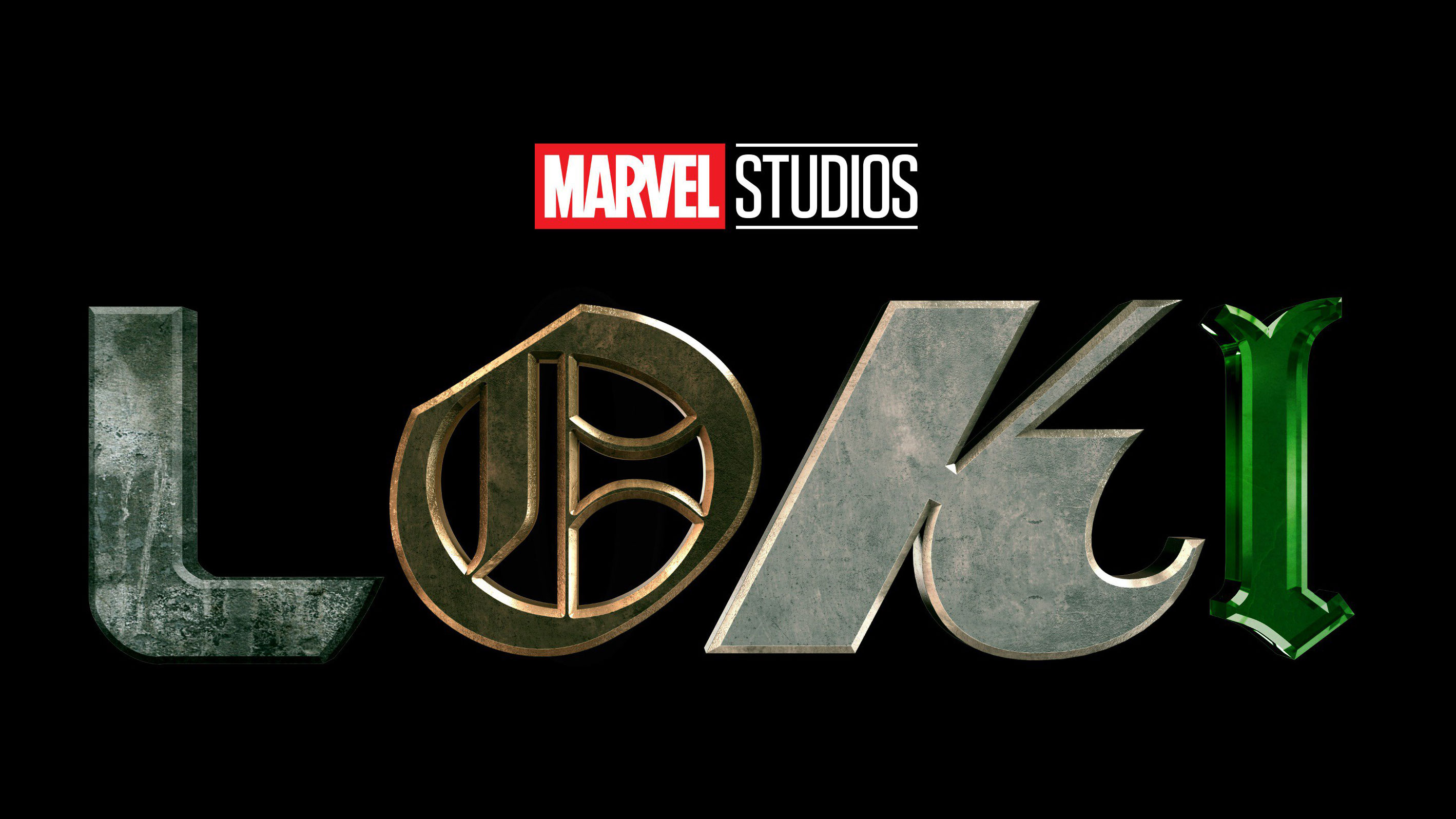
This is the hat graphic design version of “too much”. The hats are obviously an homage to the Disney+ series Loki, which has an equally dumb logo.
These hats are barely legible, let alone well designed. Seems like something some simple and understated would’ve worked. Like putting the word “Cleveland” in white font and a black outline on one side of the Block-C in a smaller, simple font, and then putting the word “Indians” on the other side in the same small, white font/black border.
It would’ve been a little understated, but at least it would’ve made sense. One of the first rules of graphic design is to keep the font type the same as much as possible. It’s too distracting
Just like these hats. Maybe that’s the plan though. Maybe Manfred is in alliance with New Balance and he’s purposely creating new hats that suck just to distract fans from the terrible job he’s doing as commissioner.