3 things Cleveland Indians got wrong with new name Guardians

3. The logo miss
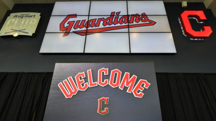
Twitter is doing what it does best, hating on stuff, and a lot of outrage after the announcement was directed toward the new logo, which is a “G” with wings.
Remember when the Angels took the halo off their hat in 1995 and went with wings, while adding a new font of “A?” I think that lasted about five or six years until they want back to the more classic look.
Smart move, and it happened to coincide with their run to the 2002 World Series.
Surely, “G” logo can’t be what we’re getting longterm because there’s too many marketing opportunities being left on the table. I could see it on the sleeve, but on the hat?
The Tribe doesn’t have to use the bridge guardians–they can invent their own and slap him on some hats. Slider can hang around as a mascot, but the Indians can invent a new one. The opportunities are endless.
That said, the Indians released a second video hyping the new uniform and the logo, which makes me think that the G will be on the hat.
I’m still holding out hope for something cooler, though. I don’t think it has been heavily reported, but I’ve been told that the window to have on-field uniforms made for the 2022 season is very small, so at the very least, Cleveland needed to get its order in.
Next. 3 reasons Indians got it right with new name Guardians. dark
Hopefully, the team unveils something…anything…that will make us want to rush out to the team shop to buy.